Welcome back! Today we get to meet Our Creative Corner's Guest Designer for August!
I am so proud to introduce Candy Colwell, one of the most talented artists in crafty
blogland and one of the kindest, loveliest people ever....I have adored her work since I first started blogging.
The first piece of
work I ever saw of Candy's made my jaw drop to the floor...It was so
beautiful, so inspiring and she made me want to continue my journey as an
artist...ever hopeful that I might one day be nearly as good as she
is!!! Her work contains so many gorgeous little intricate details, and is put together with so much thought and such an eye for detail. I have been inspired by many artists in crafty blogland, but Candy has been one of my main inspirations from the beginning, and her work continues to amaze, inspire and teach me....
You can imagine how thrilled and honoured I was when she accepted my invitation to be my Guest Designer this month!!!
Well....I could go on and on and
on about how wonderful I think her creativity is (and I think I have probably caused her enough embarrassment already)........
So I will just say it really is my greatest
pleasure to introduce a wonderful artist for you all to enjoy.....
*************************************************
Hello Our Creative Corner!
I am Candy Colwell of
Creativity Is Contagious and I am thrilled that Laura asked me to be a Guest Designer for this month's "Summertime" theme.
We are asked what sparks our imagination when we think of the word "Summertime". For me, what immediately comes to mind are bright sunny skies, the sweet songs of chattering birds and butterflies fluttering from delicate flowers to feathery greenery.
So I have created a sweet album featuring one of my favorite things; Tim Holtz' Small Folio. I will tell you now, there are a lot of photos in this post so grab a cuppa and enjoy!

This small folio is covered with what is probably my favorite Tim Holtz paper stash release, Wallflower. Those papers have such gorgeous vintage images of all of my favorite things; flowers, birds, butterflies and other beautiful ephemera images. They were perfect for this summertime themed piece.
I love the versatility of Tim's folios. They have a sturdy outside covering, perfect for covering with papers and adding your own special style through mixed media art. The interior offers plenty of space for dimensional embellishments and a kraft waterfall insert that is perfect for adding all sorts of extra "pages" using ephemera, envelopes, tags, or whatever your heart desires. I created all of my inset pages first and then covered the folio itself. You will see what I mean as this blog post continues. For more information and a video with
Tim Holtz sharing some beautiful finished folios, click
HERE.

(You can click on the photographs to get a larger look at the details of each page).
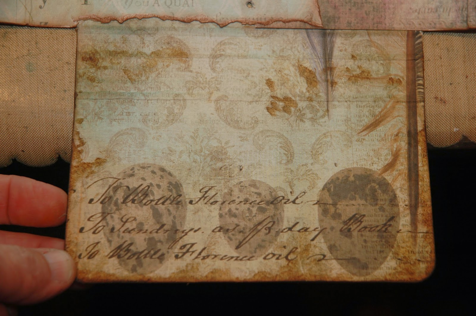
I began my interior pages that I would attach to my "waterfall" insert with the birds' nest and eggs image on the left. This is from Tim's Waterfall 12 x 12 paper. Isn't it fabulous? It looks like a book cover and that is how I wanted it to feel. So, I mounted the paper onto a piece of heavy chipboard and clipped the exterior edges to round them off using a Crop-A-Dile Chomper. Next I took a Craft Glue Stick and smeared it onto my book cover in random places and wiped off most of the glue. While the glue is still a bit tacky, I added Gathered Twigs Distress Ink over the glue using my Ink Applicator, lightly rubbing the ink into the glue and also distressing the rest of the paper, particularly around the edges. The ink will be much more intense in the areas where the I smeared the glue. I love the way that the glue makes the paper look even older. I then added some darker Walnut Stain Distress Ink and Black Soot around the edges of my "book cover". I colored the nest using Broken China, Vintage Photo, a little Gathered Twigs and some Shabby Shutters Distress Inks and a Detailer Water Brush. To attach this at the beginning of my waterfall insert, I added some black masking tape to the left side of the book cover, creating what looks like a book binding. But I needed to create the other side of this book cover before I attached it to the waterfall insert. So ....

I created what would be the focal point of the next page. I started out with Tim's smaller set of Cabinet Cards and a vintage photo of this sweet child from Tim's Found Relatives. The Cabinet Card on the right is what they normally look...all clean and pretty. The one of the left is how mine looked after I altered its appearance by grunging it up a bit. To do this, I first lightly sanded the entire card top. It comes with a sort of slick finish and sanding it gives it "tooth" for inks to stick to it easier. Then I added some Gathered Twigs Distress Ink around the oval opening and also around the exterior edges. I lightly did my glue trick (that I did on the book cover) in a couple of spots and then added Black Soot Distress Ink at the edges. I glued my photograph in place and then lightly added some detailing with Mercury Glass Stickles. I added more elements to this little guy as I finished out the page and you'll see those soon.

I covered the back of my Bird and Nest book cover with another of the Wallflower papers and using Jet Black Archival, I stamped some random flourishes using Tim's Fabulous Flourishes stamp. I distressed the paper using my glue stick technique and Gathered Twigs Distress Ink again to randomly age the paper. Then I added Black Soot at the edges for a more worn look.
I added a Word Stick and some of Tim's Trimmings Ribbon around the bottom of the Cabinet Card and glued it in place using 1/4" Scor Tape around the sides and bottom; leaving the top open to create a pocket. I made a tag and added it inside of the pocket. Here you can also see the kraft waterfall insert and how you can simply just keep adding things to each tab to create "pages". Now that this page was well underway, it was time to move on to the next page...

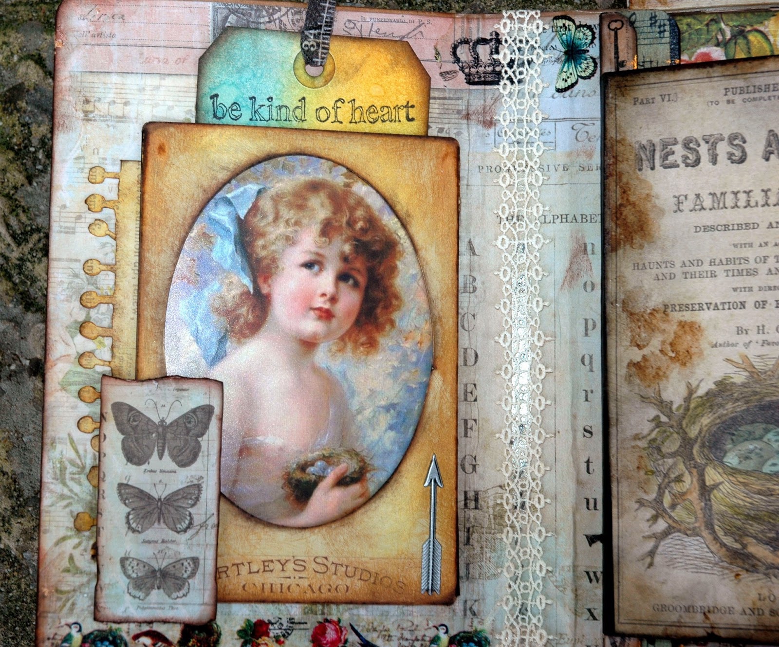
I am in love with Tim's Found Relatives cards. I love this little girl as well and thought she would be such a beautiful little butterfly. So, I cut her out and colored her using pink chalk to colorize her dress and bow in her hair. Then I inked around her edges using a Chestnut Roan Cats Eye Ink Pad. Here's a tip: you always want to ink your cut edges of paper when doing vintage work. Exposed white paper edges definitely do not give your piece a vintage look!
I had this butterfly image and liked the shape of it to create wings out of book text for my little girl.
(Sorry for the flash exposure on this picture)
To finish out this page, I used that bird's nest and eggs image again. I colored the eggs with Weathered Wood Distress Ink and a Detailer Water Brush and made a slit behind them using a Kraft Knife. Then I slipped my little girl's legs behind them and glued them in place on the underside of the paper BEFORE I glued the paper in place on the kraft cardstock page I'd created to attach to the waterfall insert. I added some Washi Tape with butterflies on it at the top because I loved the little pop of color it provided. I also placed a little piece of lace behind my butterfly girl and on top of the nest and gave her a "BELIEVE" banner to hold. I added "FLY" from Tim's Ransom Alpha Parts letters. They are originally black but I dabbed a Gold Paint Dabber on top of them to give them a gold appearance and also a textured surface. I also added some Washi Tape to the left edge with some wonderful little vintage images on it. I colorized the tape with Broken China Distress Ink followed by a little light smearing of a Gold Paint Dabber. I would later add a Hitch Post and a Monocle to the upper right section of the page. You will see that later in this post.

This is the focal point of the back side of my little butterfly girl page. The entire page is created from a section from a 12 x 12 paper. I carefully cut around the birds with a kraft knife so that I could slip my vintage image of the Willimantic Thread ephemera underneath them. I sized the ad to fit my page and then I layered it on top of a piece of cardstock that I'd cut out and created a tab on the upper left side. I sewed it together on my sewing machine because I love that look.

Here is the entire page with its layers of papers, a bit of Tim's Trellis Frameworks on the left side that has been colored using Broken China Distress Paint and distressed with Gathered Twigs Distress Ink. I added the Victorian Velvet colorized vintage lace across the top using 1/4" Scor Tape and also a piece of vintage lace and a File Tab with "secrets" at the top of my Willimantic ephemera. Finally, I added "life moments" stamped onto Vintage Photo Distress Cardstock using Jet Black Archival Ink and images from Tim's Simple Sayings stamp set. I later added a Journaling Ticket with a Remnant Rubon number "4" to the left side.
I am terrible about continuing to add more stuff once I get a project together. I keep looking at it and always seem to find ways to improve it. But, at some point you just have to say "STOP!!" (smile)

Across from my page above is this tag. I covered a tag with Tim's Tissue Tapes and then lightly covered those with Victorian Velvet and Broken China Distress Paints followed by a top coat of Picket Fence Distress Paint. I stamped Tim's beautiful lady from his Nature Walk stamp set onto Specialty Stamping Paper and colored her using a Detailer Water Brush and Scattered Straw and Tattered Rose Distress Inks for her skin tones and also the blush in her cheeks. Worn Lipstick gives her that color in her lips and Faded Jeans creates her blue eyes. I cut her out and glued her onto the tag. Next I heat embossed "journey" from Tim's Traveling Friends stamp set and Black Embossing Powder. I used some old Making Memories Rub On letters that I had to create the rest of the sentiment. I die cut the edge of the tag using Tim's Ornate On The Edge die cut and added the metal band from Tim's Industrial Borders. After I completed the other side of this tag, I machine stitched around it and attached it to the waterfall insert using Tim's Mini Attacher.

Here is the backside of the "life is a journey" tag. The background for this tag was created using Scattered Straw and Gathered Twigs. I used Tim's Spritz and Flick method to create the mottling in the background and then added the spritzes of color with my Broken China Distress Marker and Tim's Distress Marker Spritzer. I stamped the butterfly and the sentiment from Tim's Fairytale Frenzy stamp set. The butterfly's wings are colored with Broken China and a Detailer Water Brush. I also added some bits of Tim's Tissue Tape. Notice the black stamping on the kraft waterfall insert to the right of the tag? This is a simple and easy way to embellish those tabs if you don't want to completely cover them with paper or add some sort of mixed media technique to them.
Another really fun and easy thing to make and add to a folio are library card pockets. I covered these two pockets with papers from Wallflower and then added some of Tim's Remnant Rubons.
Then I simply added some 1/4" Scor Tape to the backs of them and attached them on top of the next kraft waterfall tab. See how easy the construction of these "pages" are?
Next I decided to add a large #10 manila tag as my next page. I created the blended colors using Broken China, Scattered Straw and a bit of Wild Honey. Then I stamped Tim's honeycomb patter and also a partial branch from Tim's Urban Chic onto the tag. I would finish this tag out after I decided what I wanted to do to the other side....
And here is the other side....the side that I eventually liked better so it would be the front of the next page. It's not finished in this picture...but I really liked the way it was going. I stuck several little feathers inside of the egg strip and added the letters "soar" from my Making Memories Rub On Letters. The paper is distressed with Broken China and Wild Honey. There is also a pocket created at the bottom of the page. Before I secured my feathers in place permanently, I machine stitched around the tag.
Now that my waterfall pages were complete, I needed to cover the folio itself before adding my insert. So, I set that to the side and ...
I covered the exterior and interior of my folio with beautiful papers from Wallflower. I collaged some of the sheets by tearing and distressing the edges. I also added some more of that beautiful colored butterfly Washi Tape to add little pops of color and more butterfly images here and there.
And don't forget to cover the flaps on the ends as well! These are blank right now but I can always add photographs, stamping or more ephemera as I continue to add to this little folio.
Now that the folio was covered, it was time to put it all together.
I added another layer of the butterfly paper to the bottom of my waterfall insert and placed it on top of the original one at the back of my folio because I love that butterfly image and I wanted it to be what I'd see when I flipped through my interior pages. So I added strips of 1/4" to 1/2" Scor Tape to the back of the butterfly paper and then pressed it into place right on top of the same paper on the back of the book. Wha-lah! Interior pages in place!

Now it was time to add some of my own personal touches to the exterior of my folio. So, I added some of Tim's Organza Ribbon Roses Trimmings using 1/2" Scor Tape. I added a piece of vintage lace to what would be center of the spine of the folio and I added some Texture Paste through Tim's Harlequin Stencil to the front of the folio. I lightly brushed some Gesso over the entire cover and added hints of Broken China, Wild Honey and Victorian Velvet. Finally, I distressed around all of the edges using Gathered Twigs and Black Soot at the edges. I also used my glue stick technique on the back side, just to add a few "age spots" among those gorgeous flowers.

For the front cover of my folio, I added this sweet little girl holding a song bird in a larger Cabinet Card of Tim's. I aged the cabinet card here in the same way I did on the one I used in the interior. I added a piece of Tim's Tissue Tape to the photograph and as you will see on the finished cover, I also added a piece of vintage lace for a softer look. I created the little picket fence out of craft sticks that I painted with Picket Fence and then lightly distressed with Gathered Twigs. I created the fence look by wire wrapping them together. I added a piece of cardstock to the bottom and hot glued moses and bits of excelsior grass to it. I also added some sweet summery flowers to the finished piece once I had glued it in place.
Now that you've seen the construction of the book, let's have a flip through of the finished piece. When you put it all together, it's like something magical happens when you open the cover.
Here is the way the folio looks when you open it up. The interior cover is created from a bit of colorful birdie Washi Tape across the bottom and yet another Cabinet Card (distressed in the same manner as the other two) in the center. I have made another pocket out of the Cabinet Card and added a tag. The sweet little girl holding the nest is an image I found on the internet and sized to fit my card. The little metal arrow to the lower left is from Tim's Industrial Borders.
Here is a closeup of the interior cover. Turn the Nests and Eggs page and ...
Here are the finished next two pages, complete with filigree metal butterflies and little dimensional roses colored to enhance the colors in the folio. The little butterfly girl has the added Monocle with Tim's Remnant Rubs Words sentiment dangling from a Hitch Post and the Journaling Tag with the Remnant Rubs hand and sentiment attached. It's the little details that make all the difference!
And here are the next two pages. Even just a tag being used as a page works because of all of the other things around it ... the covered library pockets behind it and the full page to the left of it. I think that the variety in the size of the pages of the waterfall and the interaction of them are what makes these little folios so special.
Flip the tag and here is the next page.....
Flip the library pockets to reveal the next page ... the large tag with the feathers now attached and colorful butterfly Washi Tape on the back side of the kraft waterfall insert. And finally ...
The last page and the back side of the tag that I ended up adding this sweet sentiment and the beautiful long strip of ephemera from the Wallflower paper stash.
On the side opposite from what would be considered the spine of the folio, I added this piece of large Washi Tape that looks like a filmstrip. Before I glued it in place on the folio, I added Broken China Distress Ink to color it. Then I added the sentiment, letters and vintage bird stamps in each section using Jet Black Archival Ink. Since it was already sticky on back, I simply just pressed it in place.
Here are the two tags that I created for the inside of the folio. They are stamped using a variety of stamps that I have. I love the birds! They are from Crafty Secrets.
Here is the finished exterior of the folio. You see the elastic straps that hold the folio closed. These were removed during the construction of the folio and then easily replaced upon it's completion. You just have to use your Kraft Tool to poke holes through the paper you cover the folio with and then thread them back into place.

Here is a closeup of the finished cover. The first thing you will notice is the addition of the sweet summer flowers. They add so much, don't they? I also added "sweet life" Remnant Rub words at the top of the Cabinet Card and a bit of the left over Trellis Frameworks piece behind the Cabinet Card. I also added a Filigree Metallic corner from
The Funkie Junkie Boutique and a small rhinestone button to the upper left corner. I added metal wing from Tim's Regal Adornments to the upper right corner. It was been altered from an antique silver finish with the addition of Treasure Gold Green Amber Guilding Wax and a small pink rose. I have threaded a "CURIOSITIES" Word Band onto the elastic band and dangled an Enamel Tag with a Remnant Rub On Bee from the Word Band.

So there it is, my ode to summertime and my contribution to Our Creative Corner.
I would like to thank Laura so very much for asking me to be a Guest Designer for her. I think her art as well as ALL of the members of Our Creative Corner's design team are such talented artists, so willing to share their art and their creativity with everyone. I am thrilled to have been asked to share my art with all of you.
I hope that this piece has somehow inspired you to create something reminiscent of our summer that seems to be fleeting all too quickly and join in on the "Summertime" challenge!
Thanks so much for stopping by!